In January of 2019, I took the User Experience Design course at BrainStation Toronto. With design and tech advancing so quickly, and user interaction now a big part of the entire design process, I felt the need to update my own knowledge as well. This app prototype was my final project submission.
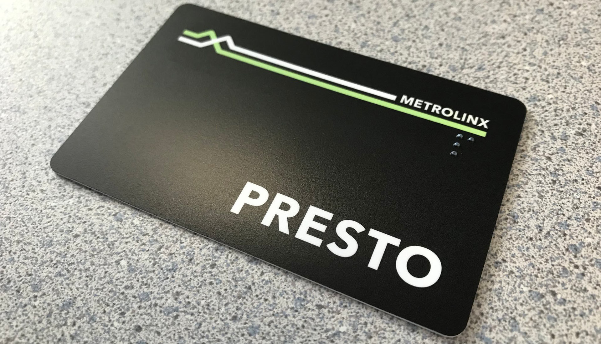
The Problem: Where’s My Presto Card?
Oftentimes we misplace our Presto card. We’re left looking all over the place trying to remember the last place we could have placed it. Which coat pocket it could have been in. Which pair of pants we last wore. And sometimes, we end up being late for work or class because of this.
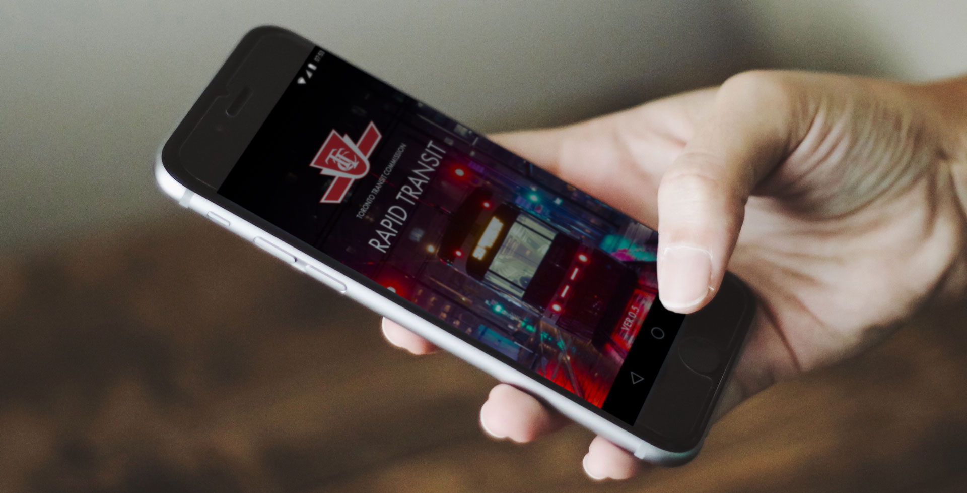
The Solution: The TTC Rapid Transit App
The TTC Rapid Transit App is meant to help streamline the commuting experience. Users of this app will be able to link the app to their Presto account, and tap and pay with their smartphone as they board buses, streetcars, and go past station turnstiles.
People may misplace their Presto card, but they always have their smartphone with them.
User Research
Interviews were conducted with 3 individuals with varying degrees of transit usage. A female art director at a large corporation, a male video editor at a post-production house, and a male production manager at a tech company.
Questions asked mainly pertained to what their main interactions with the TTC is like, followed by questions on how likely they would use an app with integrated payment ability.
Each interviewee uses the TTC based on their own life-style and work situation. Insights gained are as follows:
For the most part, users of the TTC don’t have any major complaints about the service, but wish communications about delays and route changes were better
Presto seems to be a small point of contention. Though nothing major, users wish it was a smoother experience end-to-end.
Users all feel that using the TTC is cheaper than using a car due to gas prices, but frequency of usage depends on personal circumstances
Overall feelings about the TTC is that it’s OK, but could be better.
These interviews would result in the creation of two user personas.
User Personas
Persona 1: Fiona
Name: Fiona Age: 27-32 Occupation: Marketing Account Manager at an Advertising Agency Lifestyle: Active (likes to jog and hike)
Profile:
Lives between the Danforth and the Beaches with easy access to subways and buses. Enjoys hiking, travelling, and exploring her neighbourhood, visiting various cafes, restaurants, and dessert shops. Active social life and new to the neighbourhood.
Experience with TTC:
Uses it as her main mode of transportation across the city, but if possible, prefers to walk. Does not own a car. Uses the TTC almost daily to commute to work and social engagements. Does not like Uber because of price and worries about safety as a female. Does not find too many issues with the system aside from notifications when there are delays. Thinks the Presto Card is an annoyance. If travelling across the city, being able to plan routes would be great (routes, points of transfer, etc).
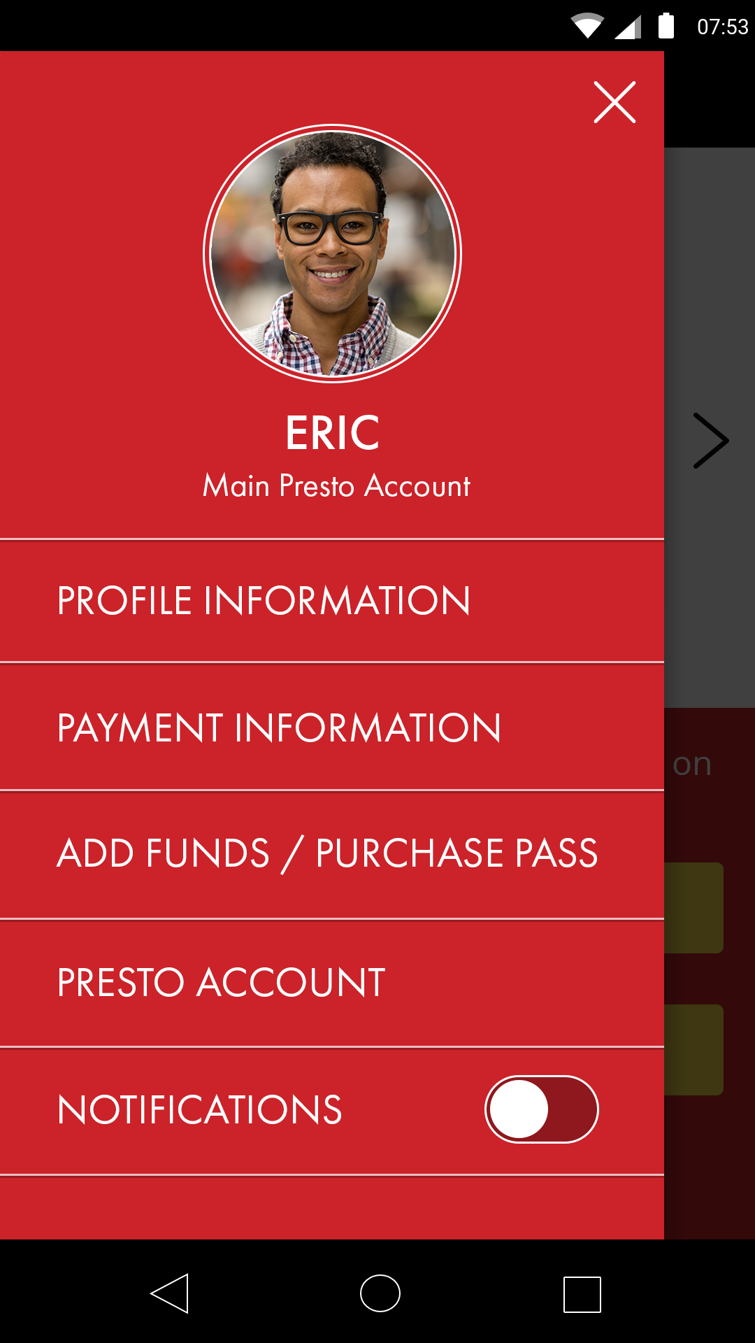
Persona 2: Eric
Name: Eric Age: 30-35 Occupation: Project Manager at a New Technology Start-up Lifestyle: Young Urban Professional
Profile:
Lives in downtown Toronto and is within walking distance to most places, including work and most social hot spots. Occasionally takes the TTC if his social gathering is outside his immediate area or if visiting family in North York.
Experience with TTC:
Walks to most places, but in bad weather or if destination is outside the downtown core, he will take the streetcar or subway. Rarely uses buses as he rarely strays too far from anywhere accessible by either streetcar or subway. Tends to use pay-per-use/cash fare rather than a monthly/weekly pass since it doesn’t make economical sense. Thinks Presto Card is a minor annoyance, but willing to put up with the convenience of being able to tap and go, but would like something more convenient.
User Journey Flows
Not everyone will use the app in the same way. Below are the user journey flows of some of the more common ways I envision users of the app will interact with it.
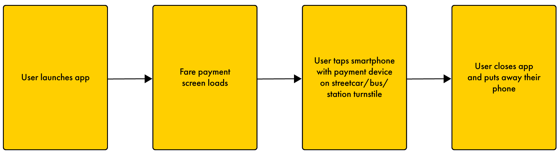
User Journey Flow: Fare Payment
The user simply wants to pay their fare with the app.
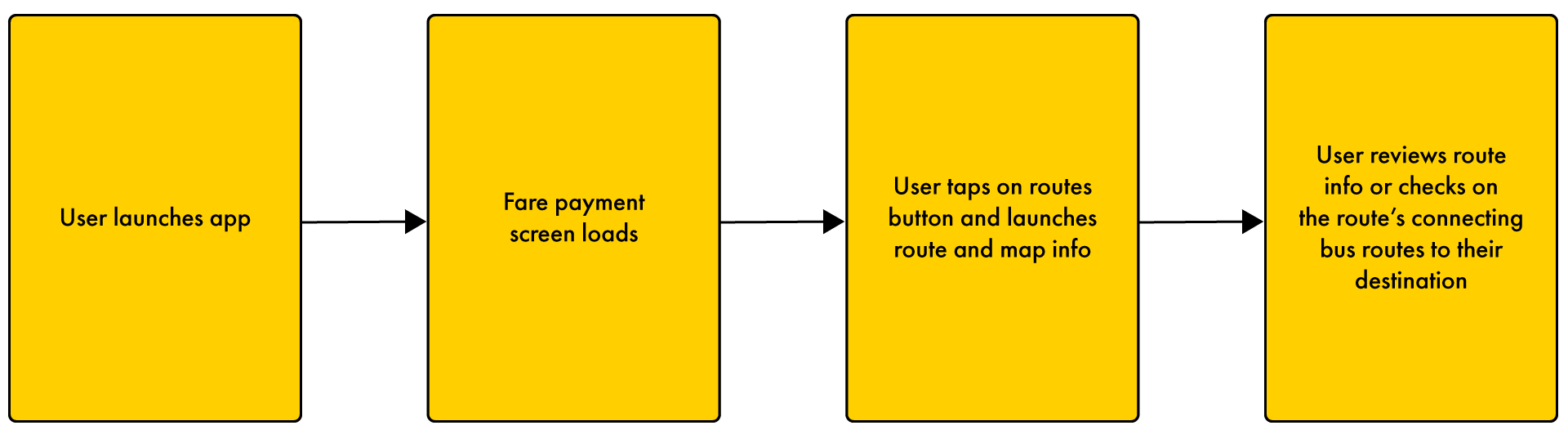
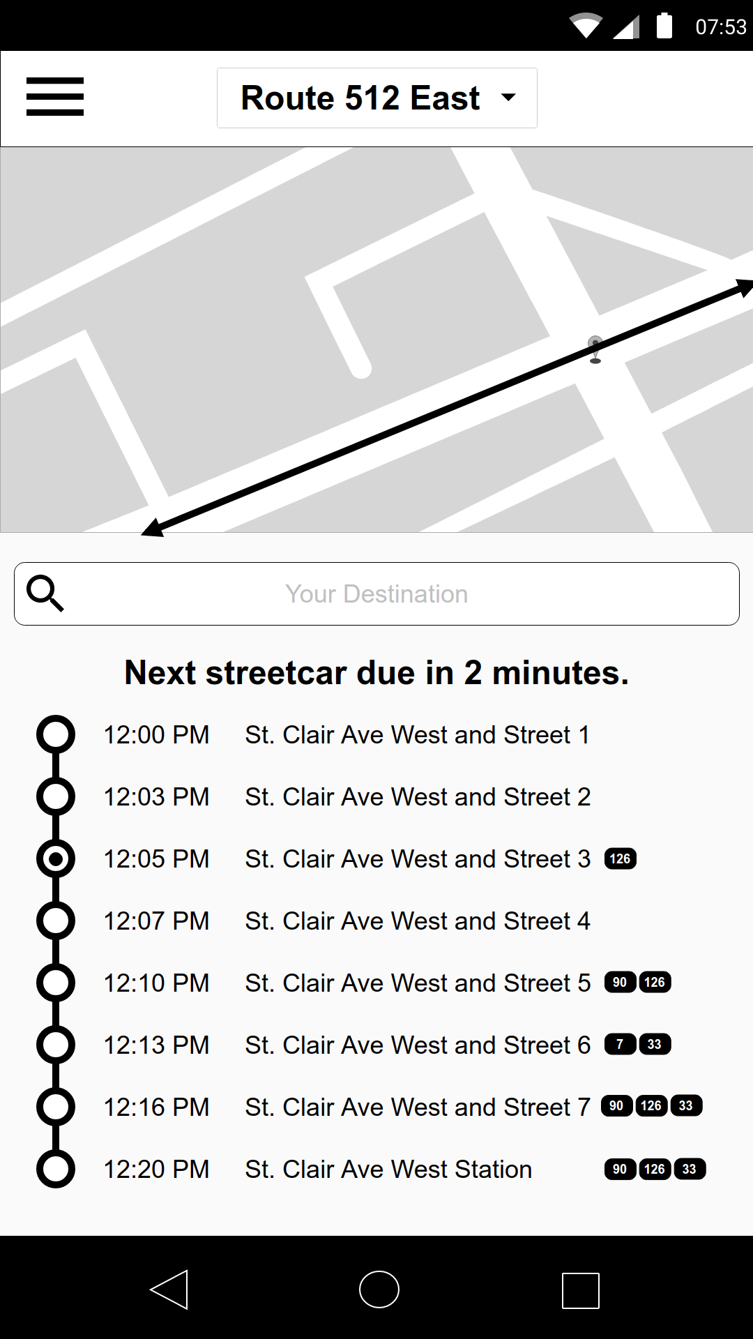
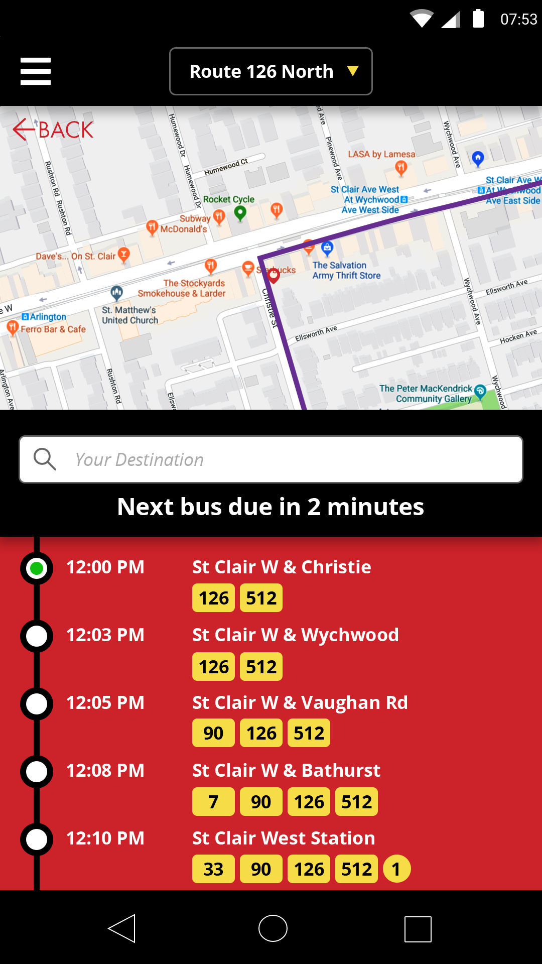
User Journey Flow: Checking Route and Schedule Information
The user is still waiting for their bus/streetcar and wants to check route information.
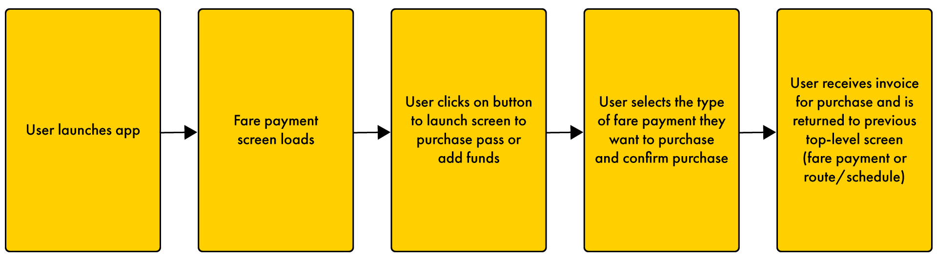
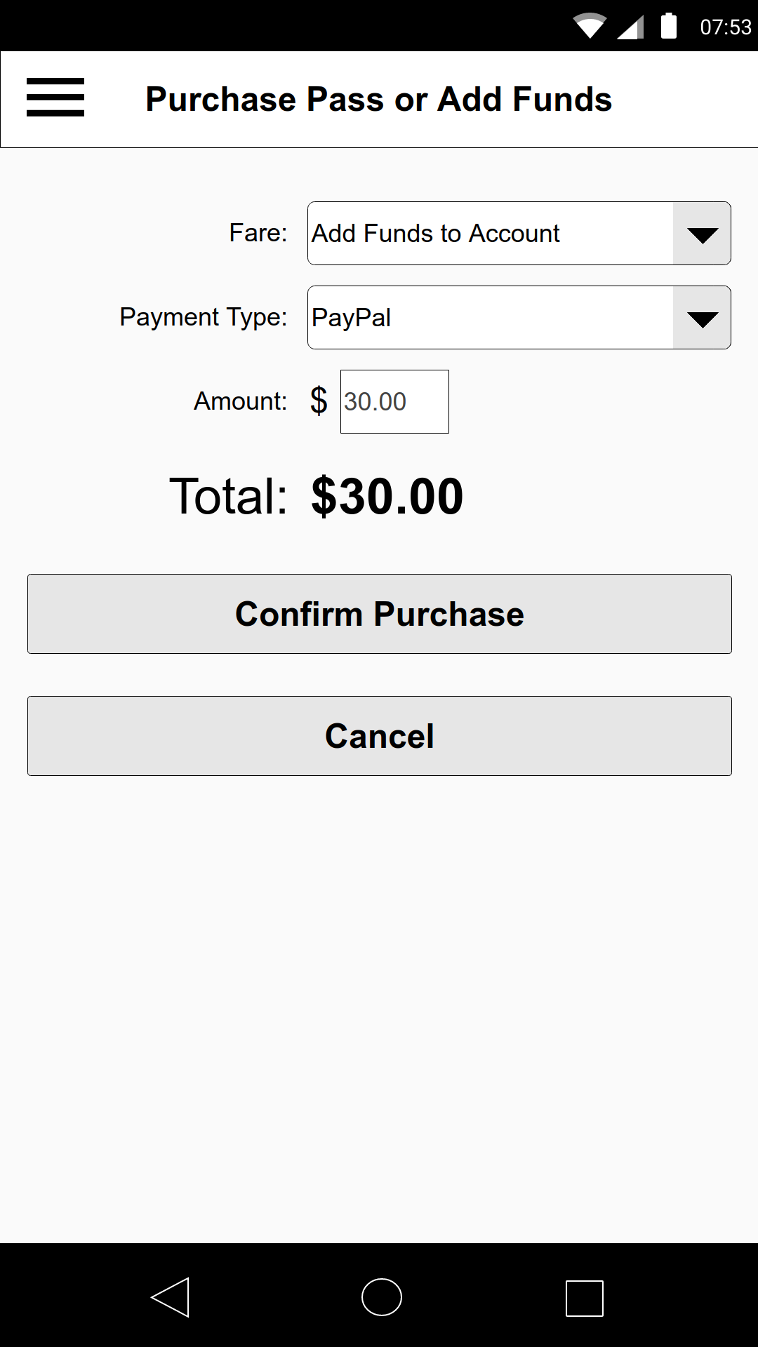
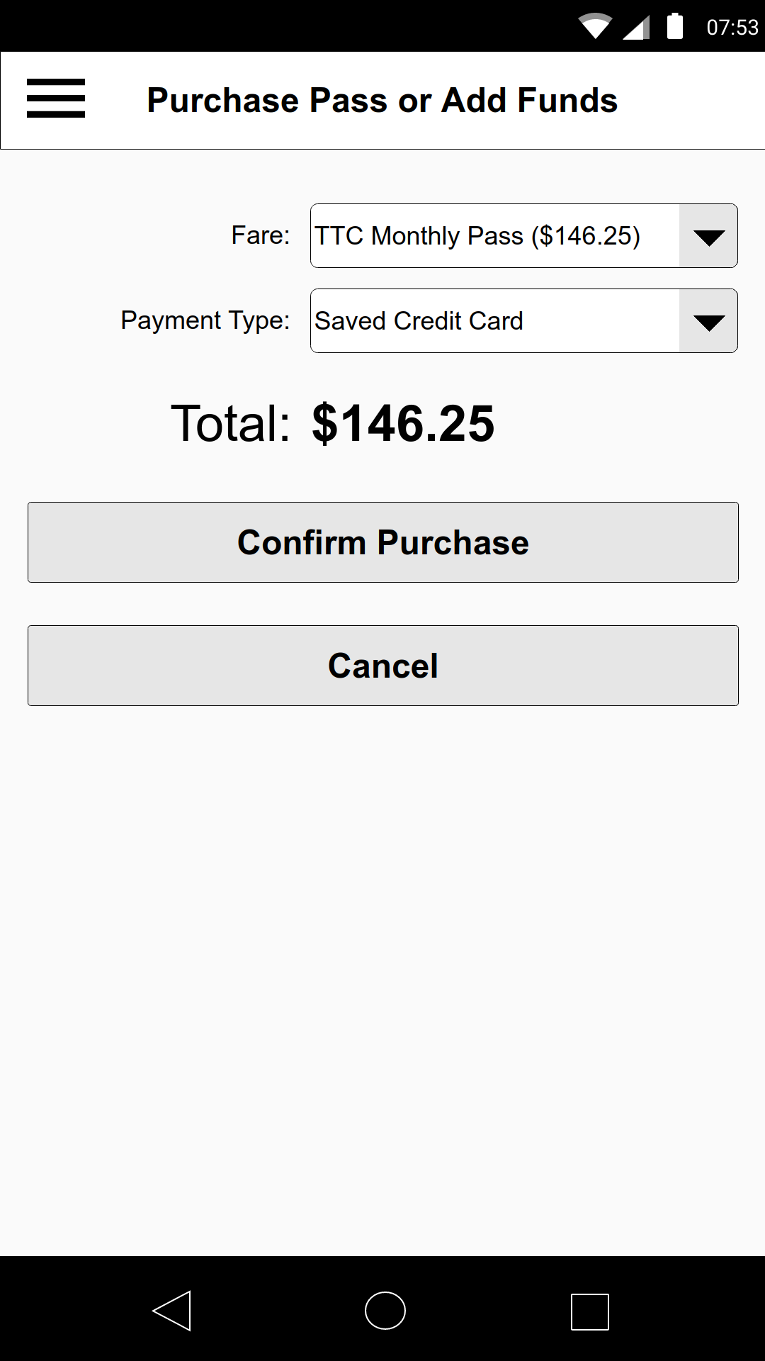
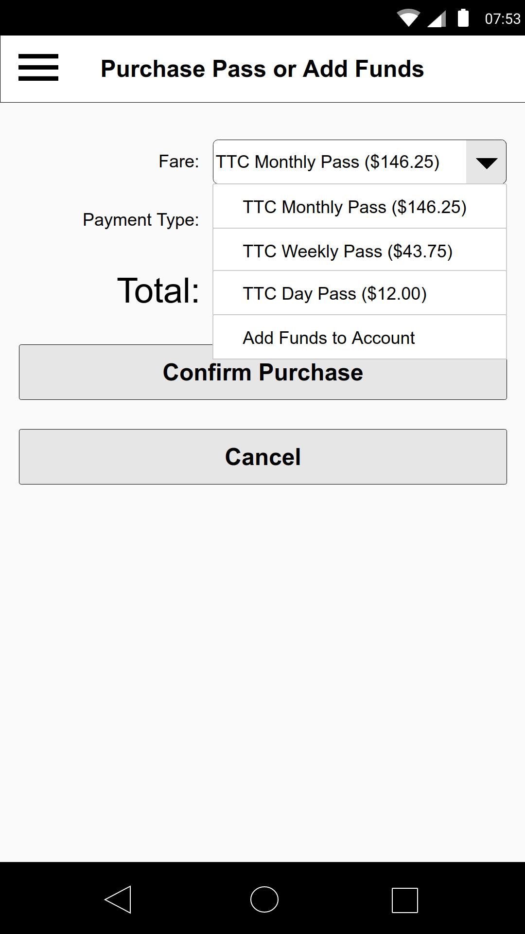
User Journey Flow: Add Funds or Purchase Pass
The user wants to add funds or purchase a new pass.
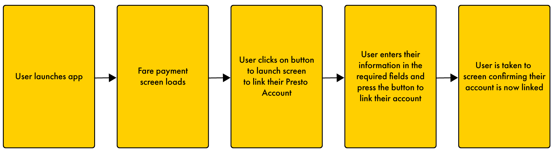
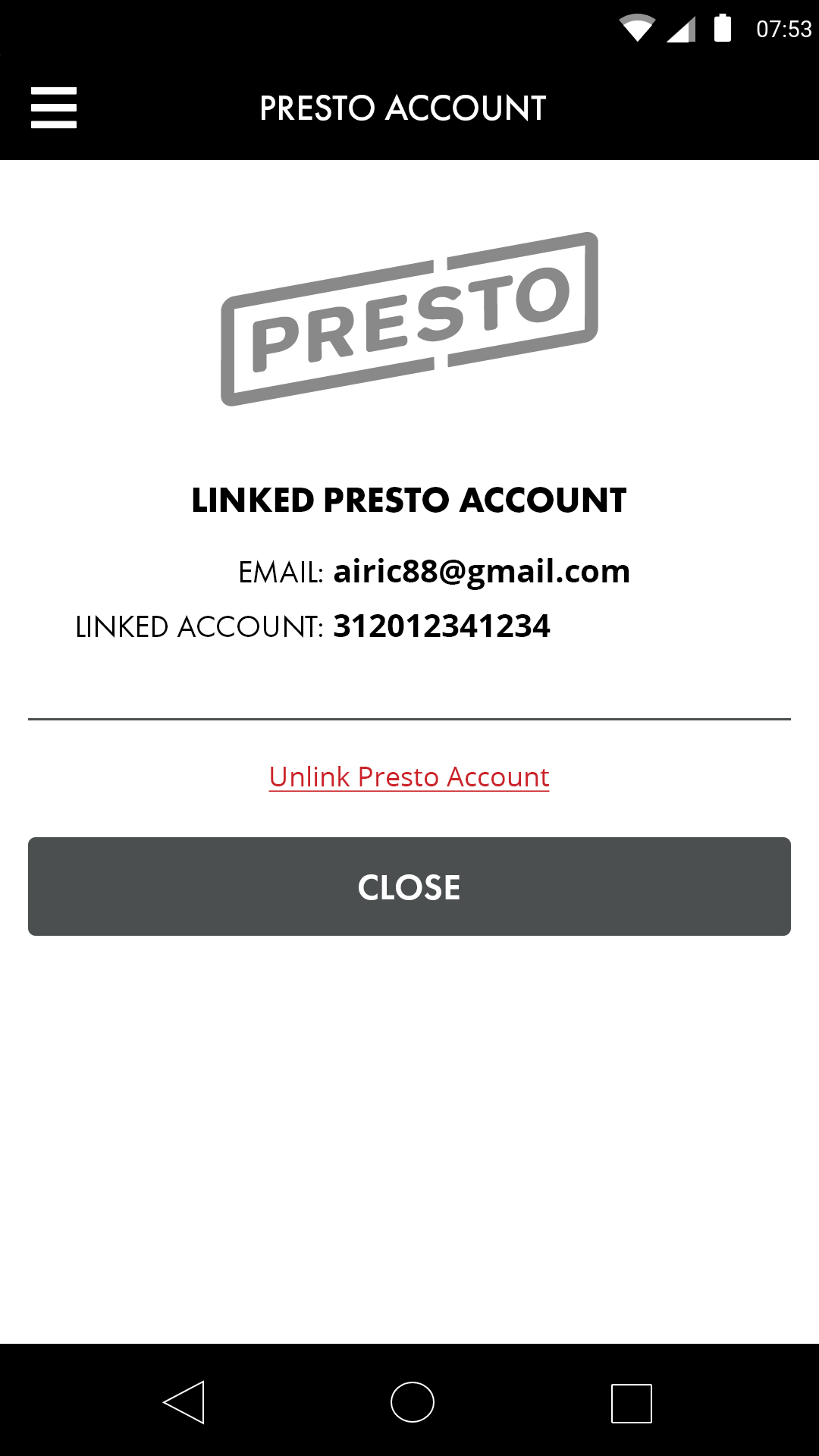
User Journey Flow: Linking a Presto Card
The user wants to link their Presto card with their Rapid Transit App account.
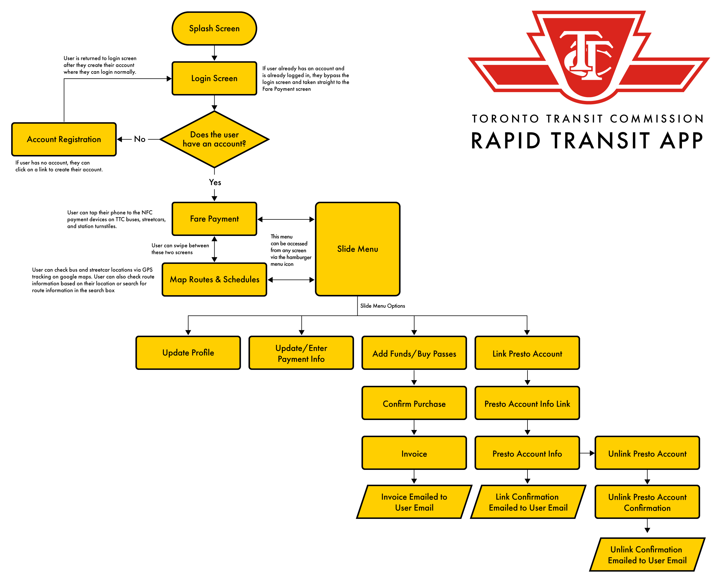
Information Architecture
TTC Rapid Transit App User Flow
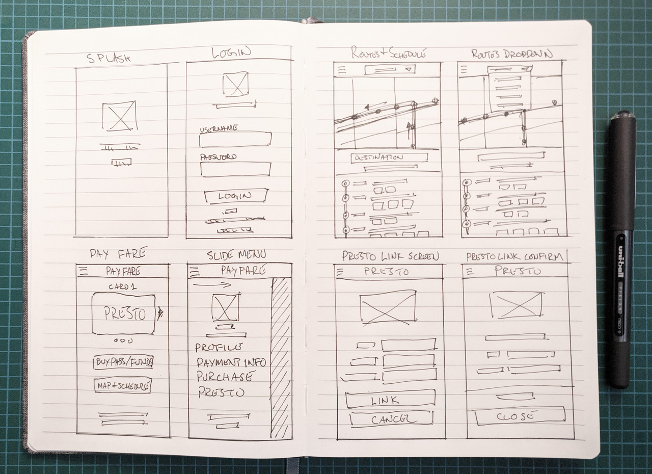
Sketches and Pop Testing
The main screens of the app were sketched out and loaded into the Marvel Prototyping app to test some of the user flows. From this app, a round of user testing was done with my classmates where I took note of some of the feedback and shortcomings experienced when testing. These wireframe sketches would further evolve in the next iteration when I would begin to build them out from Moqups into a functional prototype.
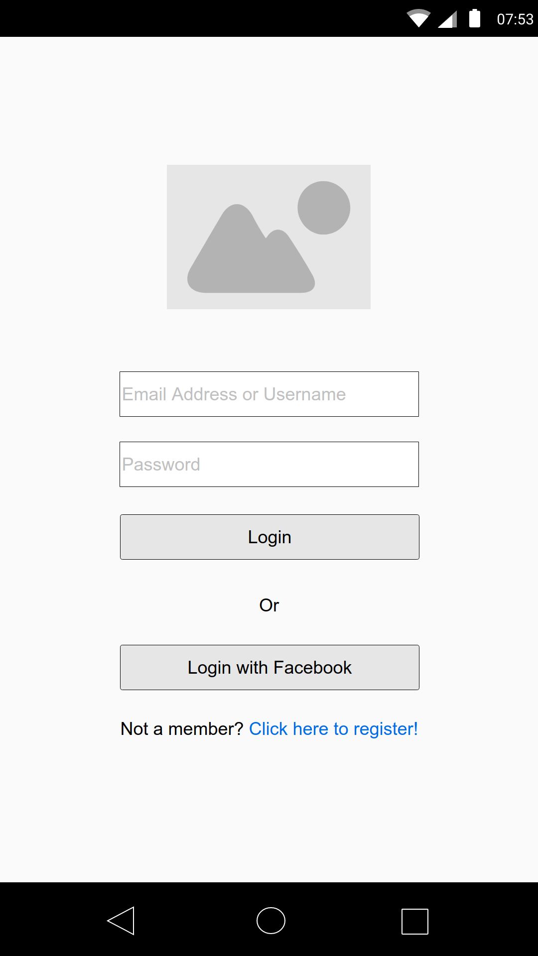
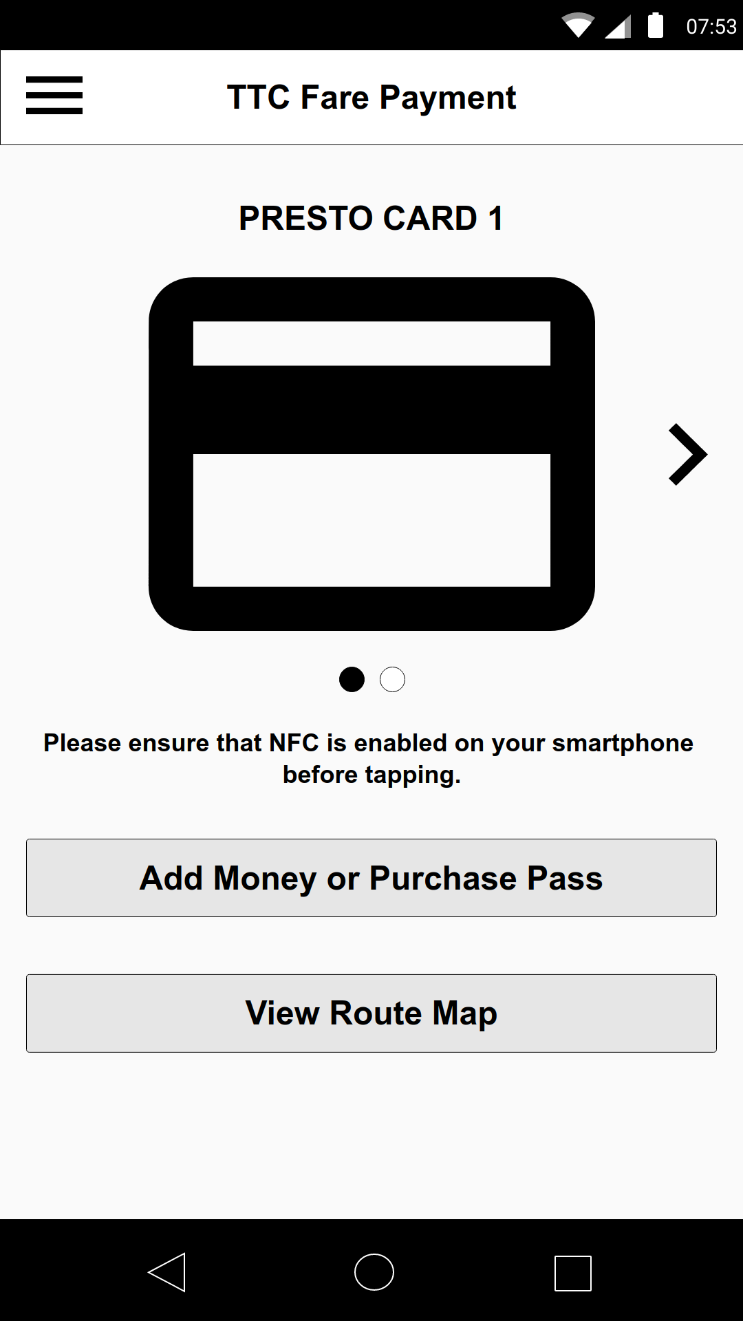
Wireframes and Prototyping
From here, I am able to build a to-scale wireframe and prototype in Moqups of the entire app. This could also be done through other wireframing and prototyping applications such as Balsamiq, Adobe XD, Sketch, even Illustrator, and so forth. Which is used really comes down to personal preference, and what is available, depending on if you are using a Mac or PC. Below are a few of the wireframes for the app, which expand upon the sketches done in the notebook. Wireframing also lets me see issues that may not have been clearly apparent when viewing the app from a very high level.
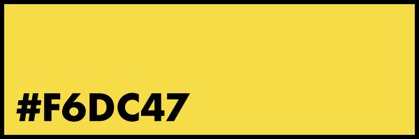
With the UI, I wanted to keep it simple and maintain the TTC branding having it prominantly in use, from brand colours, to font usage. Button styles I kept very simple, yellow for confirmation or to advance, and a grey button for cancel or close. Both the colours used came from existing TTC brand materials.
TTC Brand Colours
Typography
Font Usage
Fonts
Buttons
Style 1
Style 2
High Fidelity Mock-ups & Prototype
With the wireframes and the simple style guide as my foundation, I then created a series of high fidelity mock-ups. With InVision, I then created a functional prototype that could easily demonstrate how the app works. The high fidelity screens were designed in Photoshop.
Through the process of working on this app, it is easy to see that all the steps inform the next. From the initial idea of the problem being defined, to the scripted interviews and the development of the personas, to creating scenarios with the personas to hypothesize user flow outcomes, and then to actually test those user flows with sketches and wireframe prototypes. It is a constant process of trial and error, and testing and re-testing, and iteration upon iteration with those learnings.
If this app were to continue, then there would need to be some research into how the Presto payment system works and how it’s back-end infrastructure works. One of the main concerns is how purchase of a pass or addition of funds does not show up in the account information until a day later. This could be a real problem for people who purchase a pass or add funds just minutes before boarding a bus or streetcar or entering a station and need to pass through a turnstile to access the subway. This may speak more to the Presto infrastructure, but if Starbucks can have an app that users can easily add funds to and pay immediately, then this problem we know is solvable.