NHD - National Home Doctor
Summary
National Home Doctor Service was expanding into Canada, and in doing so, needed to comply with Canadian regulations. National Home Doctor is a service that puts patients in touch with doctors who do home visits, and allows for doctors to take on patients after hours or on weekends when some doctors offices may be closed. Since the original service was based out of Australia, some things needed to change.
Though the service went through a brand update and a new app was being designed and built for Canada, until that happened, they wanted the existing app to at least have the fresh new look of the app in development.
I was tasked with working on this “reskin” of the apps, that would serve as a bridge to the new app.
This project would have two apps. One for patients to enter in their symptoms and book a doctor, and one for the doctors signed up with this service to manage their patients list and schedule. You can think of this as something similar to an “Uber” for doctor home visits.
Patients App Featured Screens

Log In

Slide Menu

Health Check Screen
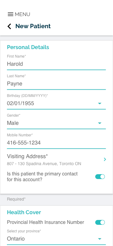
New Patient

Confirm Details
Doctors App Featured Screens

Log In

Dashboard

Patients List
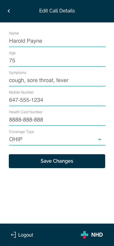
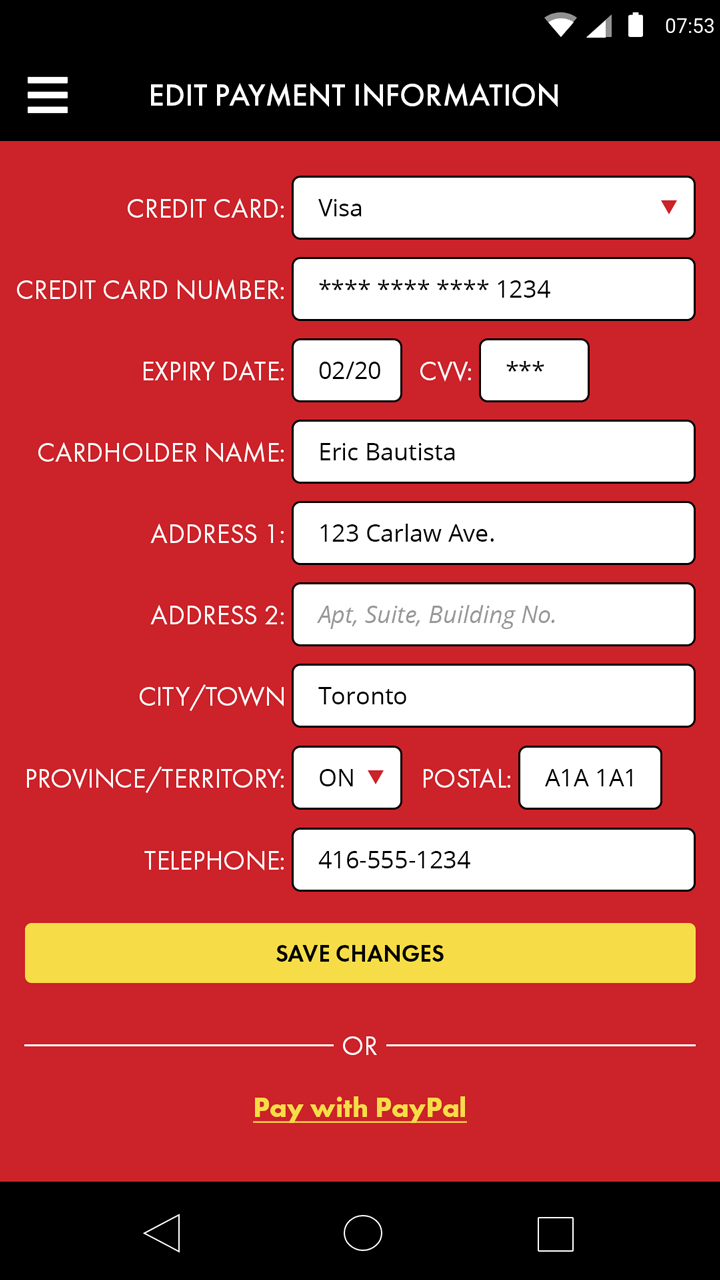
Edit Patient Details
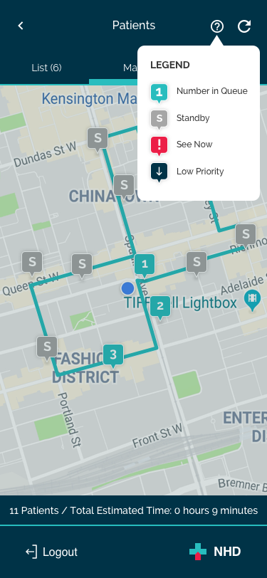
Map and Legend